
UX Researcher, UX Designer

5 months

Team of 4 with stakeholder collaboration

Miro, Figma, Figjam, Teams, Zoom, Appointlet, Zapier, Jotform

Stakeholder Interview, Content Audit, Card Sorting, User Interviews, Thematic Analysis, Site Mapping, Usability Testing
Michigan B.A.S.S. Nation (MBN) manages adult and youth B.A.S.S. fishing tournaments. However, its outdated website structure caused frequent user frustration, missed event details, and inefficient content management for staff.
Our goal: create a streamlined, user-centered experience that improves navigation, clarifies membership paths, and boosts engagement across all user groups.

Adult Anglers
Parents & Coaches

Youth Anglers

Leveraged Appointlet to streamline participant scheduling and onboarding, enabling volunteers from Michigan B.A.S.S. Nation and MBN Youth to self-select convenient times while capturing key details for engagement and incentive fulfillment.
Automated the distribution of calendar invites and consent forms links, ensuring guardian approval for minors and seamless participant onboarding.
Utilized Jotform to securely collect participant consent, properly documenting sessions for our remote card sorting study.

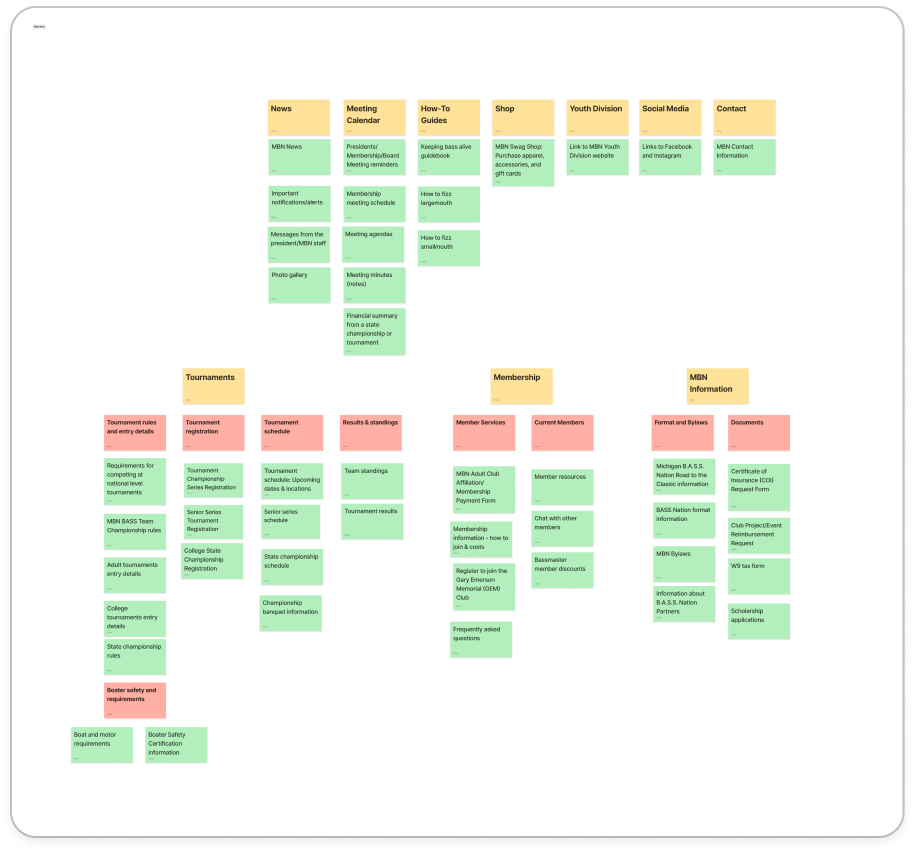
By refining the site structure and content organization, we enhanced user experience, reduced frustration, and made essential information more accessible. The new site map ensures that users—whether new, existing, youth, or adult—can navigate efficiently without unnecessary barriers.
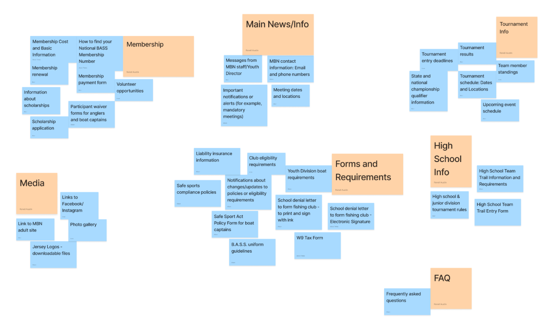
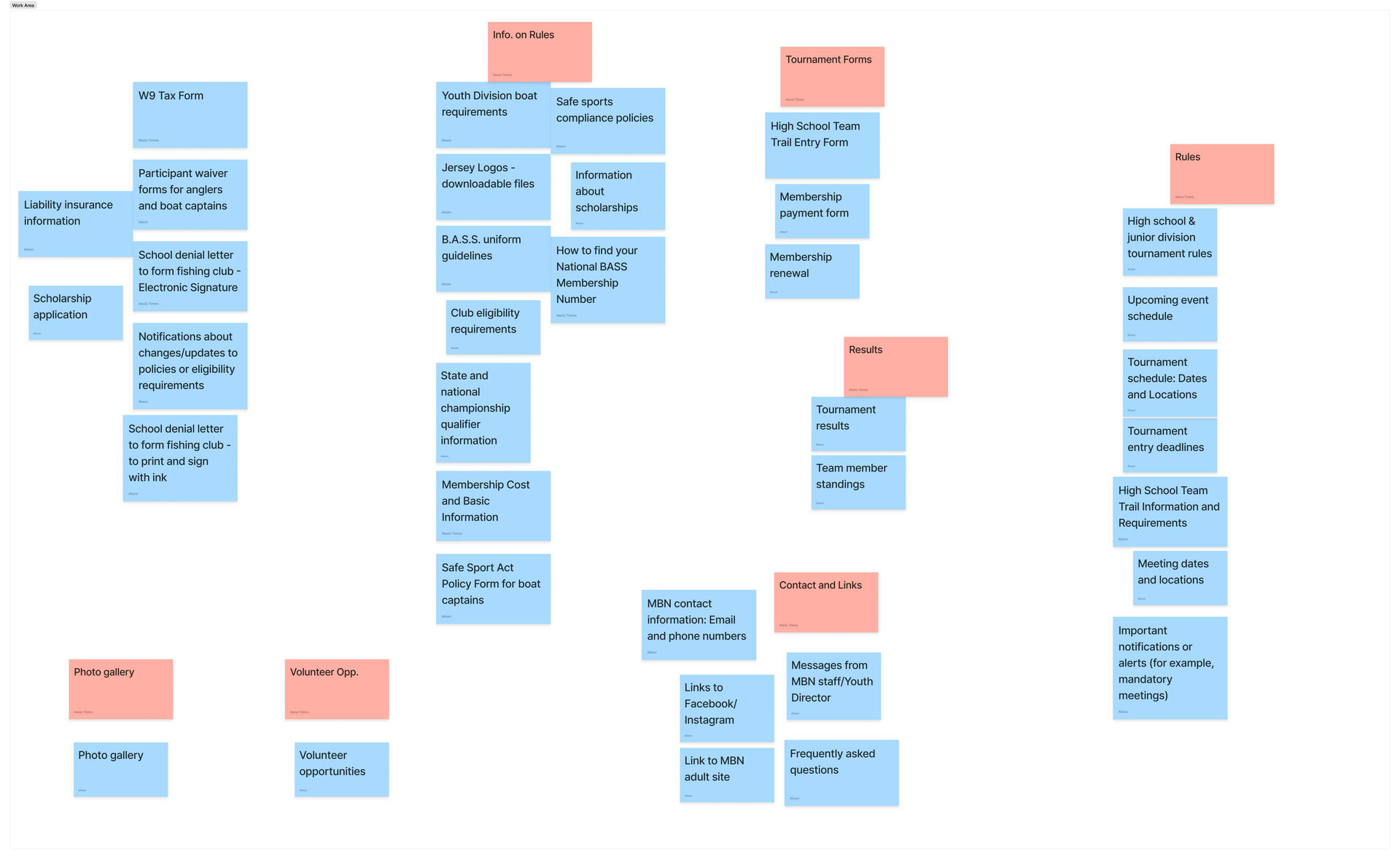
View Original Site MapSample quote. Lorem ipsum dolor sit amet, consectetur adipiscing elit nullam nunc justo sagittis suscipit ultrices.
During stakeholder review of the sitemap, the stakeholders struggled to distinguish between adult and youth memberships. One noted:
“WOW! This looks great. The only things I would change is under Become a Member I'd separate Youth and Adult on to a second level.”
— Stakeholder 2
“I can't believe you got all the content to fit on one website!”
— Stakeholder 1
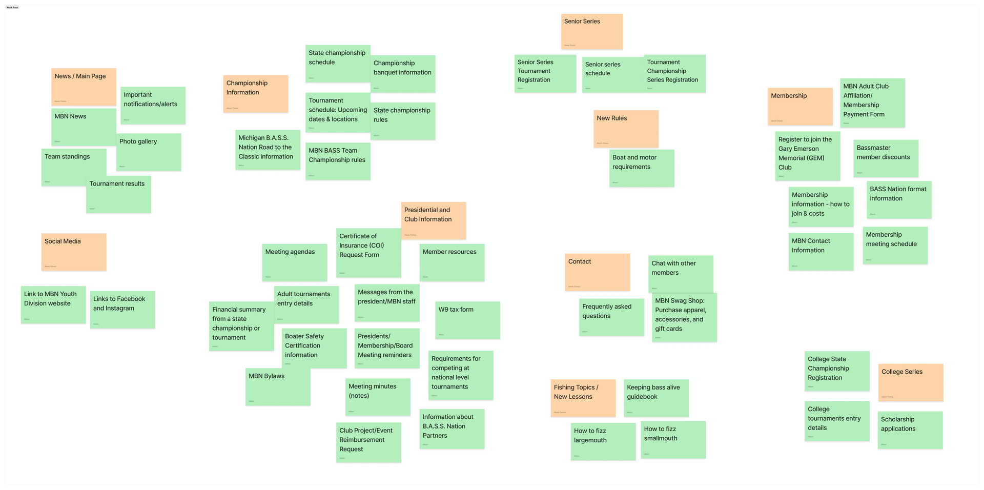
This insight led to a key design pivot: introducing clear headers and visual cues to differentiate membership types and reduce onboarding errors.
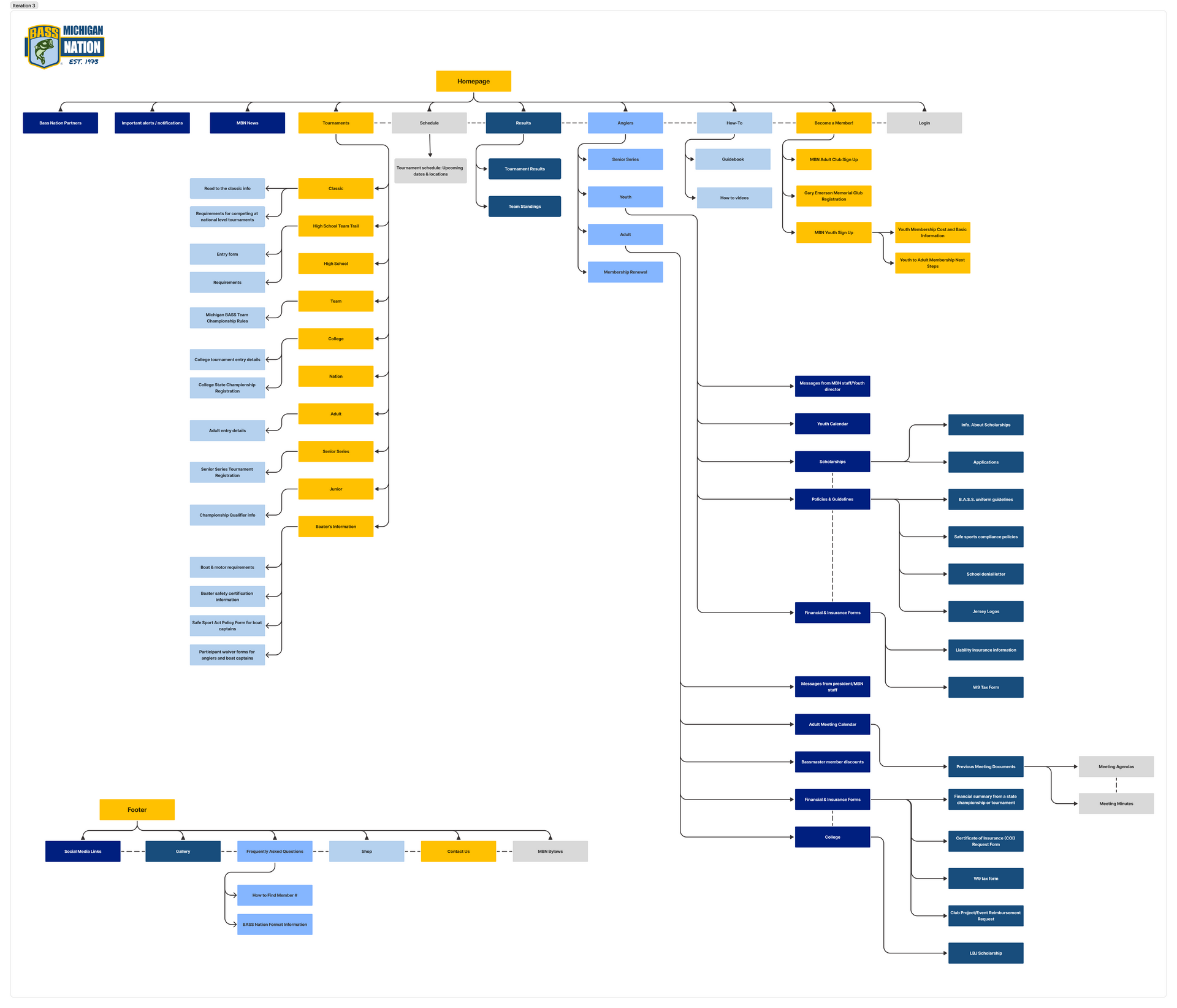
This redesigned site map directly addresses user pain points by improving navigation, reducing clutter, and making key information more accessible. By combining both the youth and adult sites and introducing a clearer structure, we've created a more intuitive and user-friendly experience for all MBN members. These changes align with both user needs and business goals, ensuring the site remains functional, scalable, and easy to maintain moving forward, positioning Michigan B.A.S.S. Nation for continued growth and member engagement.
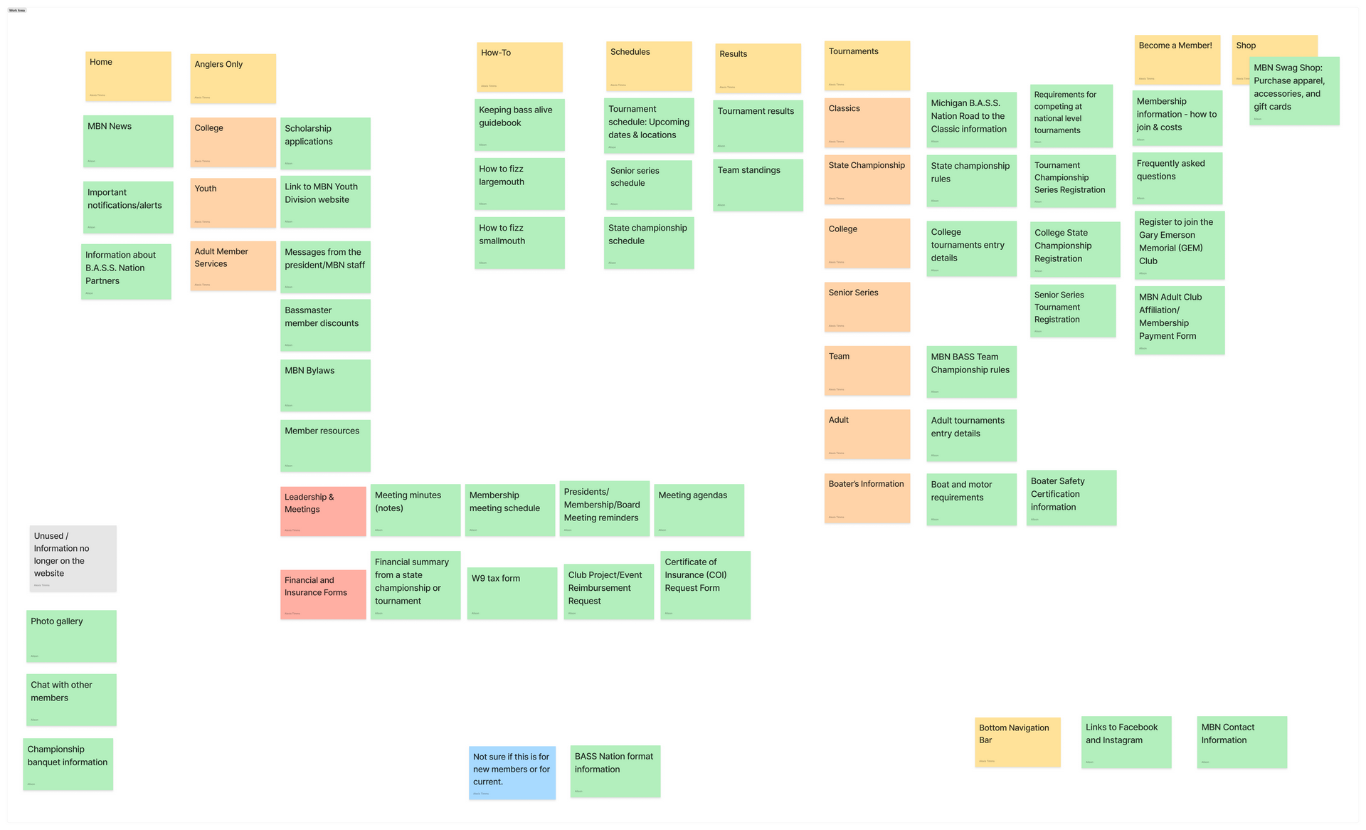
View Third Iteration Site Map
Combined both platforms into one cohesive experience, eliminating redundancies streamlined the user journey and reduced the cognitive load.

Eliminated underused sections to reduce clutter and improve focus, allowing users to focus on essential content and find what they need more efficiently.

Protected sensitive member-only content with secure access, ensuring the privacy and security.

Created a dedicated "New Members" section with clearer pathways and fewer clicks to find and complete the registration process with fewer clicks and less confusion.

Separated highly trafficked pages such as schedules, results, and eligibility into distinct sections for faster access.
This project successfully established a robust, user-centered foundation for the Michigan B.A.S.S. Nation website. Through comprehensive research and strategic design, we pinpointed critical usability issues and crafted a site structure that directly caters to the needs of both youth and adult members. The insights gleaned from this work offer a clear and actionable roadmap for future development, ensuring a continuously intuitive and highly engaging experience.

Don’t let your project be the one that got away—get in touch! Whether you're looking to collaborate, ask questions, or just talk UX, I’d love to hear from you.